Checkout Flow
Enhanced the checkout flow at Mojocare to ensure a seamless and intuitive purchasing experience for our users, reducing friction and increasing conversion rates.
Problem
The existing checkout process at Mojocare, while functional, has several pain points that hinder a smooth user experience. Users find it cumbersome, which leads to cart abandonment and lower conversion rates. Our objective was to identify these issues and redesign the checkout flow to make it more user-friendly and efficient.
Research
To understand the challenges faced by our users, we conducted comprehensive user research, including:
We interviewed users who had recently completed a purchase or abandoned their carts to gather qualitative insights into their experiences.
We conducted usability tests with a diverse group of users to observe how they navigated the current checkout process and identify specific pain points.
We analysed user behaviour data from our website to identify common drop-off points and friction areas within the checkout flow.

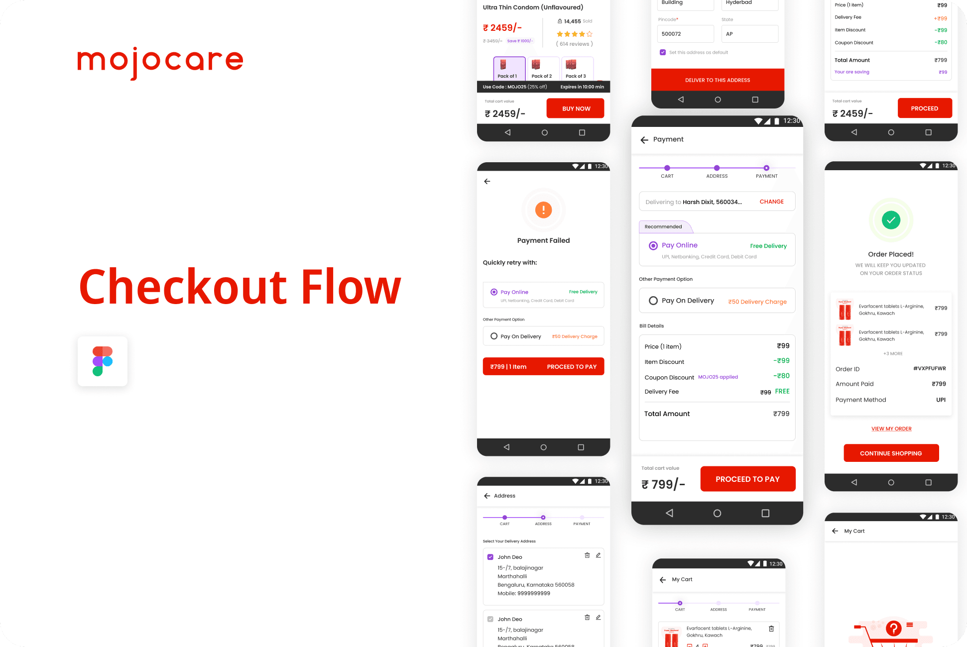
Current Checkout Flow Screen
The current screen where drop-off occurs include the following elements:
Product details with the option to adjust quantity.
Section to add the shipping address.
Sections for payment method and price details/coupons, which are collapsed by default.
A prominent "Place Order" button.

Identified Pain Points
Add address section
The current design does not effectively guide the user through the checkout process. The collapsed sections may cause confusion about the steps required to complete the purchase.
The "Add Address" button is not immediately intuitive. Users do not realize they need to click it to proceed, leading to drop-offs. (Only 10% users fill the address before clicking "Proceed to pay")
The "Place order" button is prominently placed but may not be actionable until all required information is filled, potentially causing frustration.
Payment Sections
There are multiple payment online payment options for users which provides them choice overdose of choosing which parter to choose for payment. This results in less people opting prepaid option.
Proposed Solution
Use of step-by-step indicator to show the progress of the checkout process instead of cluttering all the information in a single page.
Ensure that address form is placed before "Proceed to Pay".
Implement a multi step checkout process to provide clear guidance and improved user experience.
Cart: Review items and adjust quantities
Address: Enter and confirm shipping address
Payment: Complete the payment using the most reliable method.


Output
By addressing the identified pain points and implementing the proposed solutions, we successfully restructured the checkout flow into distinct, intuitive steps. As a result, the conversion rate increased by 55%, indicating a significant improvement in user experience and satisfaction. This enhancement not only reduced drop-offs but also streamlined the purchasing process, contributing to higher revenue and reinforcing our commitment to delivering a seamless and efficient shopping experience for our customers.